
rideMST: Monterey-Salinas Transit App
UI/UX Design Case Study (Human-Computer Interaction Class, Spring 2025)
TOOLS
Figma, Adobe Illustrator
ABOUT THE PROJECT
The rideMST App is a local transit app dedicated to the Monterey-Salinas Transit System. The app is designed to solve problems that locals face daily. The goal of the app is to increase reliability, and make the local public transportation experience more fulfilling and seamless.
ROLE & PROJECT DURATION
UX Researcher, Visual Designer (3-month long project)
1: Overview
Problem: Navigating the bus transit system can be daunting and challenging. From unreliable schedules, unexpected detours and route changes, to the overwhelming list of different bus numbers and their corresponding destinations; many commuters face a lot of challenges daily.
Solution: rideMST is designed is to increase reliability, and make the local public transportation experience more fulfilling and seamless. Key features include: Real-time tracking, push notifications about delays and detours, mobile payment, saving and accessing routes via offline mode, safety and emergency Features, complete bus list and routes, language Preferences
2: Competitive Analysis & Market Landscape
Competitve Analysis: For my competitive analysis, I looked at Google Maps, the Uber app, and the Transit app to understand their strengths and what users might still need. Google Maps is strong in navigation and real-time directions, Uber focuses on easy ride-booking, and Transit offers detailed public transit schedules and alerts. By studying these apps, I was able to see what features work well and where there are gaps—helping me identify opportunities for my public transit app to stand out and better support everyday riders.
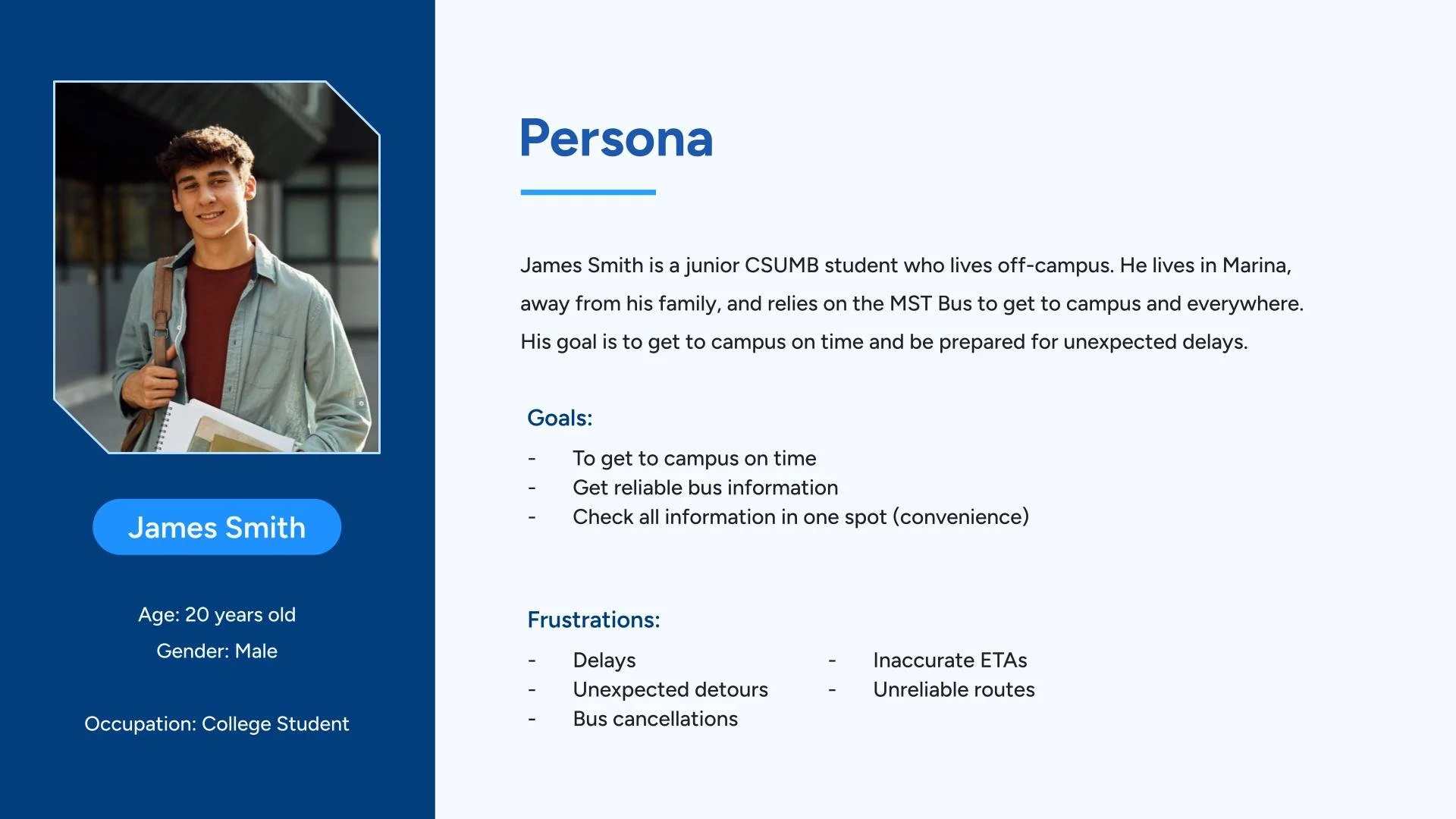
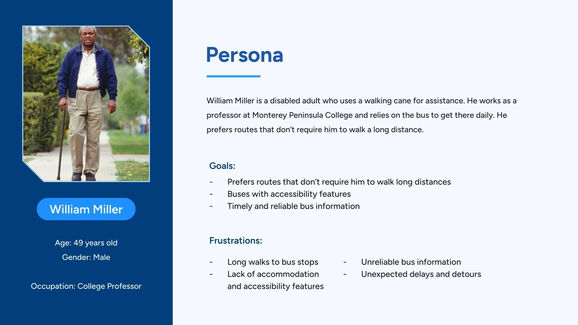
3: User Interviews & Personas
For user interviews and personas, I talked to several people who regularly use public transit to learn about their daily challenges, habits, and expectations. These conversations helped me understand what users really care about such as reliable timing, clear route information, and easier trip planning. Additionally, I created personas that represent different types of riders. These personas helped guide my design decisions and ensured the app focuses on real user needs.
Interview Questions:
How do you typically plan your bus journeys? Are there resources you rely on?
What are the most important aspects for you when it comes to the bus experience?
Was there a time where you experienced difficulty with the MST system or the overall bus experience?
Personas:
How do you deal with delays and bus detours? And where do you learn about them?
Have you ever missed a bus or hopped on the wrong bus? What caused it and how did you deal with it?
If you can change one thing about the MST bus system or on public transportation apps, what would it be and why?
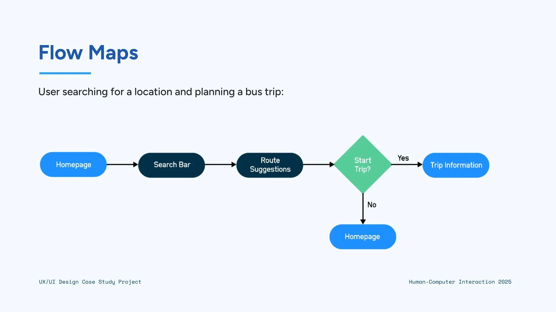
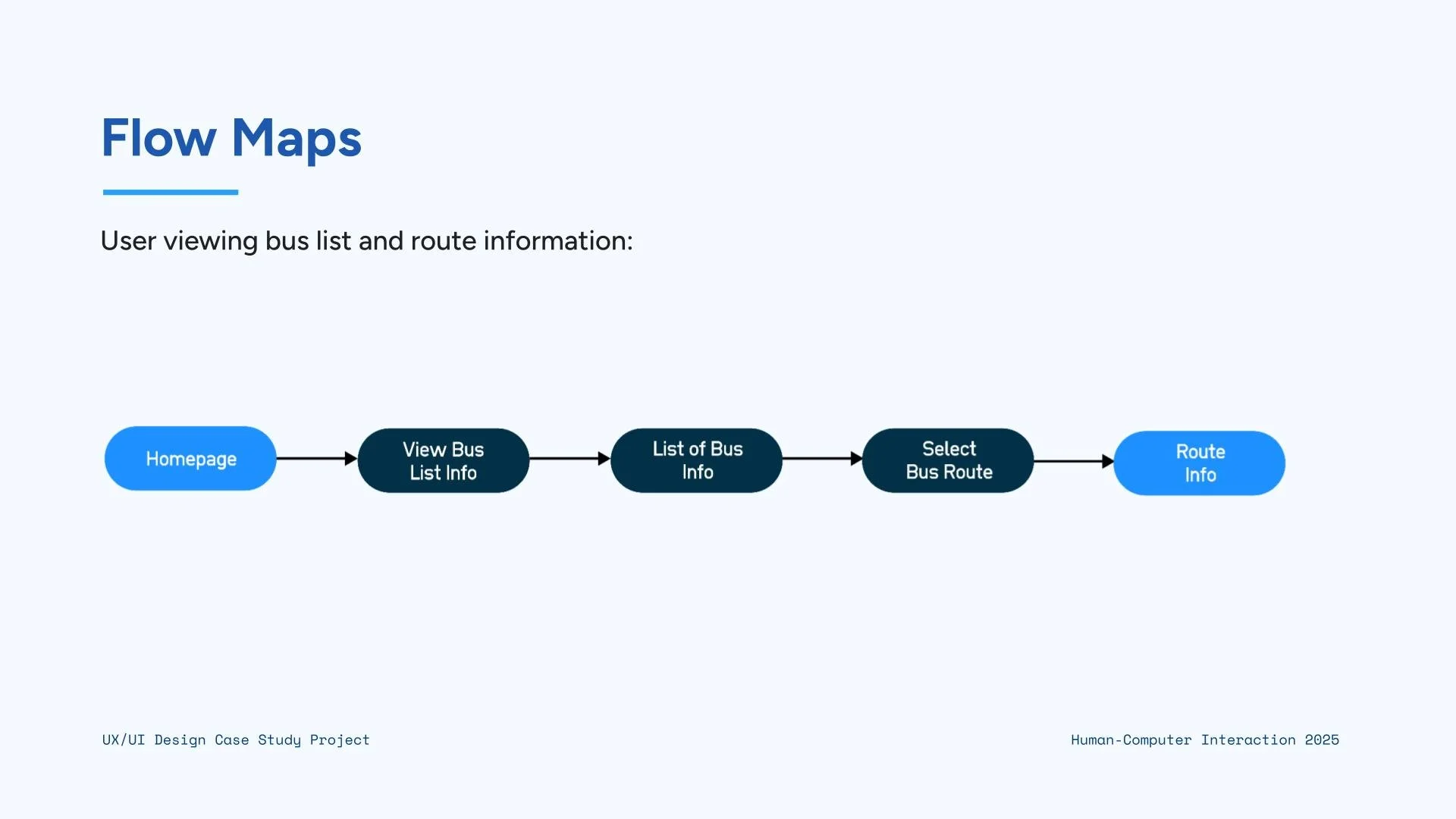
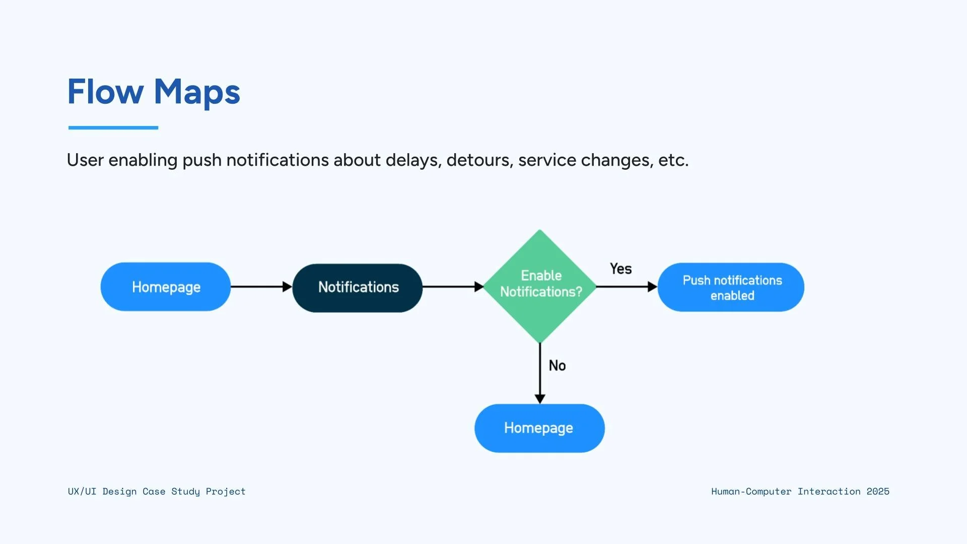
4: User Flows
For the user flows and site map, I mapped out the key steps a rider would take to complete common tasks like planning a trip, checking arrival times, or saving favorite routes. Creating these flows helped me understand the smoothest path for users to get what they need with as few steps as possible.
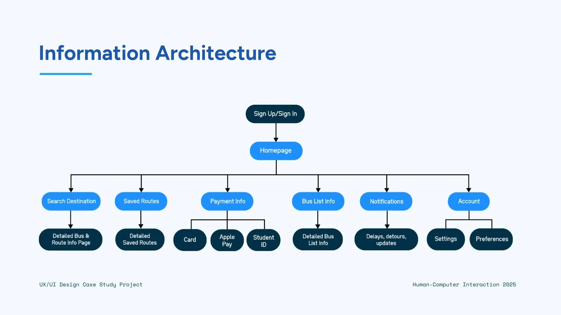
5: Information Architecture
The site map organized all the main screens and features of the app, making sure the structure is easy to navigate and supports an overall intuitive experience.
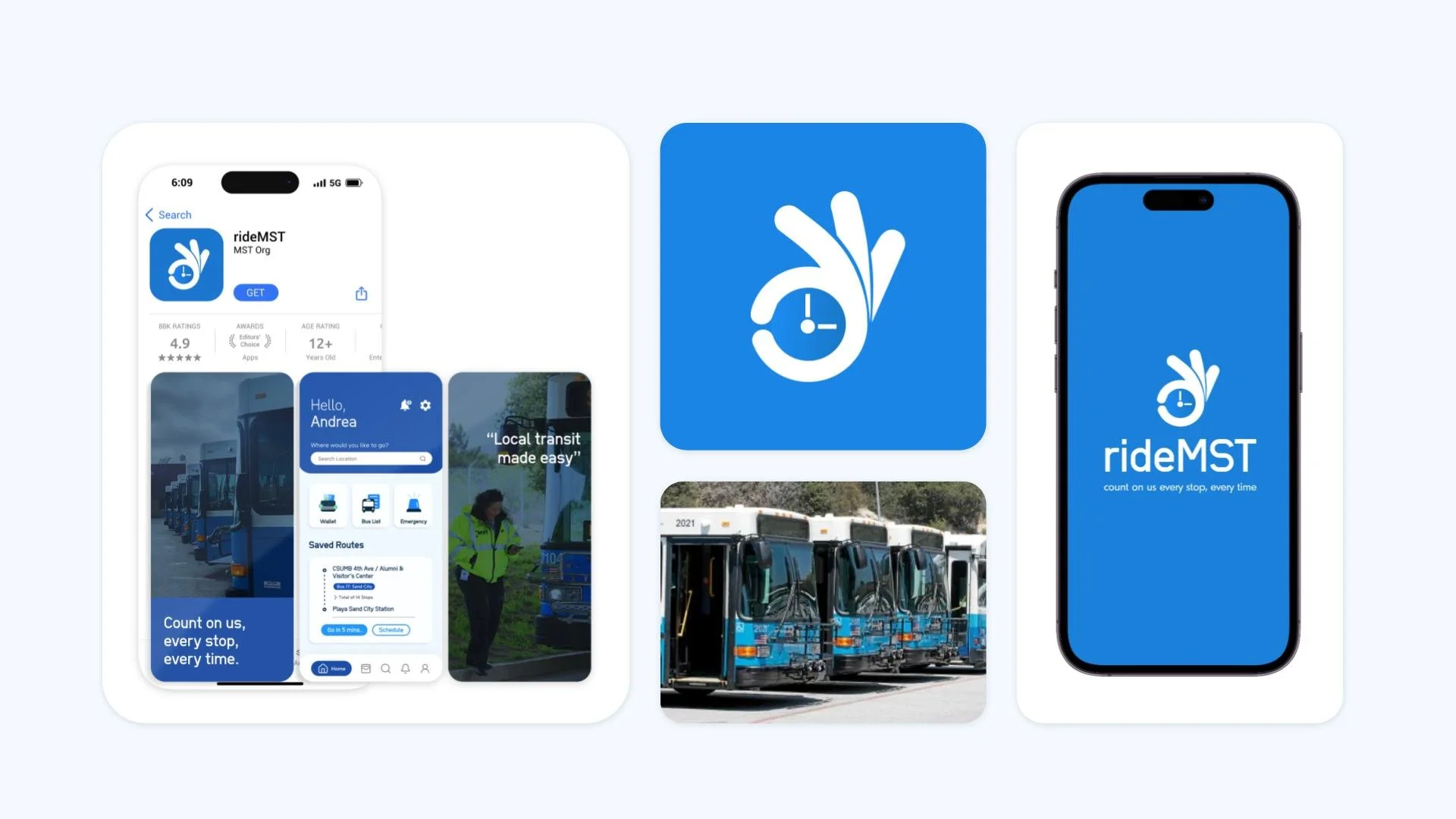
6. Visual Identity
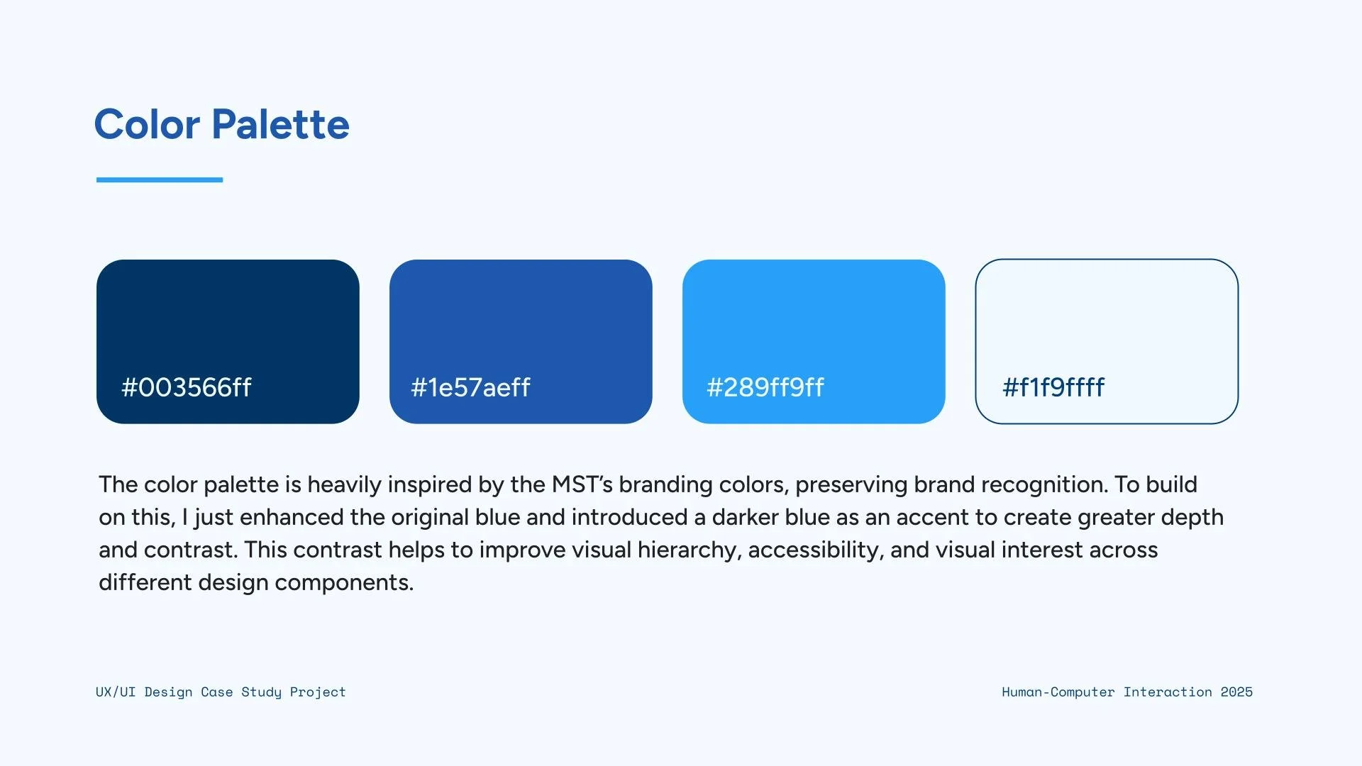
For the visual identity, I designed a logo and chose a color palette that feels familiar and trustworthy for local riders. The colors are inspired by the MST bus line, helping users instantly recognize and connect with the app. The logo and overall visual style were created to be clean, modern, and easy to read, supporting a consistent look across the app and strengthening its sense of reliability and community connection.
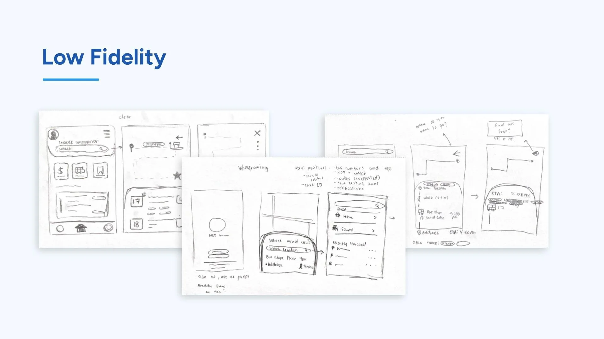
7. Wireframing & Prototyping
For the wireframes and low-fidelity prototype, I sketched out the basic layout and structure of each screen to focus on functionality before adding visual details. These early designs helped me test the overall flow, placement of key features, and how users would move through the app. By keeping the prototype low-fidelity, I could quickly make changes based on feedback and ensure the app’s foundation was clear, simple, and user-friendly.
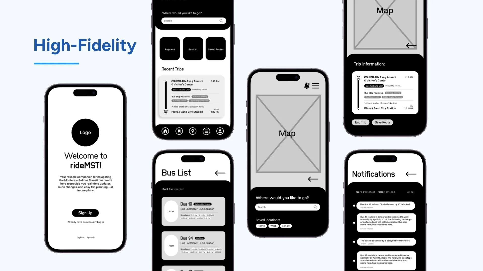
8. Figma Prototype
Lastly, I used Figma to turn my wireframes into an interactive version of the app. This allowed me to simulate real user interactions, test navigation, and refine the overall experience.